FIFTH CORNER
Role: Designer
Project Type: Social Media Design
Tools: Adobe Suite
Timeline: May 2025

Overview
5th Corner Goods and Gifts, a cherished local boutique in Delmar, New York, offers a curated selection of gifts, decor, accessories, and jewelry. To enhance its digital presence and engage a broader audience, the boutique embarked on a comprehensive social media rebranding initiative.
The objectives of this project were to enhance brand visibility, strengthen community engagement and overall increase sales and traffic to their social media presence.
Existing Social Media Audit
5thcornergoods
1.6K Likes • 1.8K Followers
Largely features photos of products from original vendors
Showcases some reels of employees
Greater interaction with the reels from viewers
Features weekly quotes that break up feed
Little interaction from followers on several posts
Average four to five posts per week, One post per day
Existing Social Media Audit
5thcornergoods
775 Posts • 1.4K Followers
Large crossover between Facebook and Instagram posts
Largely features photos of products from original vendors
Showcases more reels of products
Greater interaction from followers as compared to Facebook
Average four to five posts per week, One post per day
One to two stories per day


Brand Plan
Color Studies
I found that 5th Corner stays to a more muted color palette, following along with muted greens. This is showcased in their logo and overall design of their stores. Although I think that the stores color palette is a very good foundation, I would like to implement a more inviting palette to further draw in more people.

Original Color Palette
As you see, the store showcases a variety of greens. And as I said it is a strong foundation, but not much variation.
Typography
5th Corner features both a San Serif and Serif that stands out amongst the green background. For personal purposes I decided to stick to a Serif that remains similar to the "5th Corner" as shown to the left. While also using a san serif type for the body.

New Color Palette
This color palette features a type of green, but carries with brighter, warmer colors for a more inviting feel

Sample Posts


I wanted to focus on making the Instagram a more inviting hub for all the stores needs. This including cleaning up the bio, putting only the essentials; title, website, small blurb and address.
I kept the original logo and profile photo, as this was the basis for all of my work, and it is familiar to the viewer.
But I implemented story highlights, to keep stories that would be important for all customers to see or would want to see.
And the feed, following my new color palette, is more clear, concise and inviting to the viewer.
It did take me a few tries and critiques to find the best placement of posts. But with trials I was able to make a feed I was happy with.
This feed highlights:
Product Placement: showing the products that the store sells
Alternating Color: following the palette, the block posts alternate with photos
Events Posting: highlighting different events that the shop will vend for
Customer Testimonials: weekly quotes from customers, getting a more personal feel
Monthly Favorites: highlighting new or seasonal products
Inspirational Quotes: the stores current Instagram likes to post weekly quotes, so I wanted to keep that, while following the feed
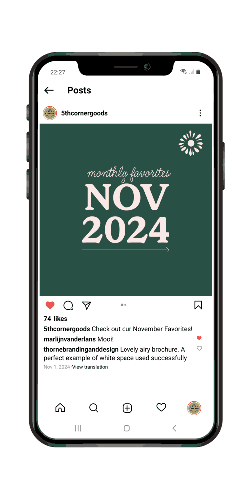
Monthly Favorites
Here's an example of how a "Monthly Favorites" carousel will look
Again, highlighting seasonal or new products to customers, offering name and small blurb to go along
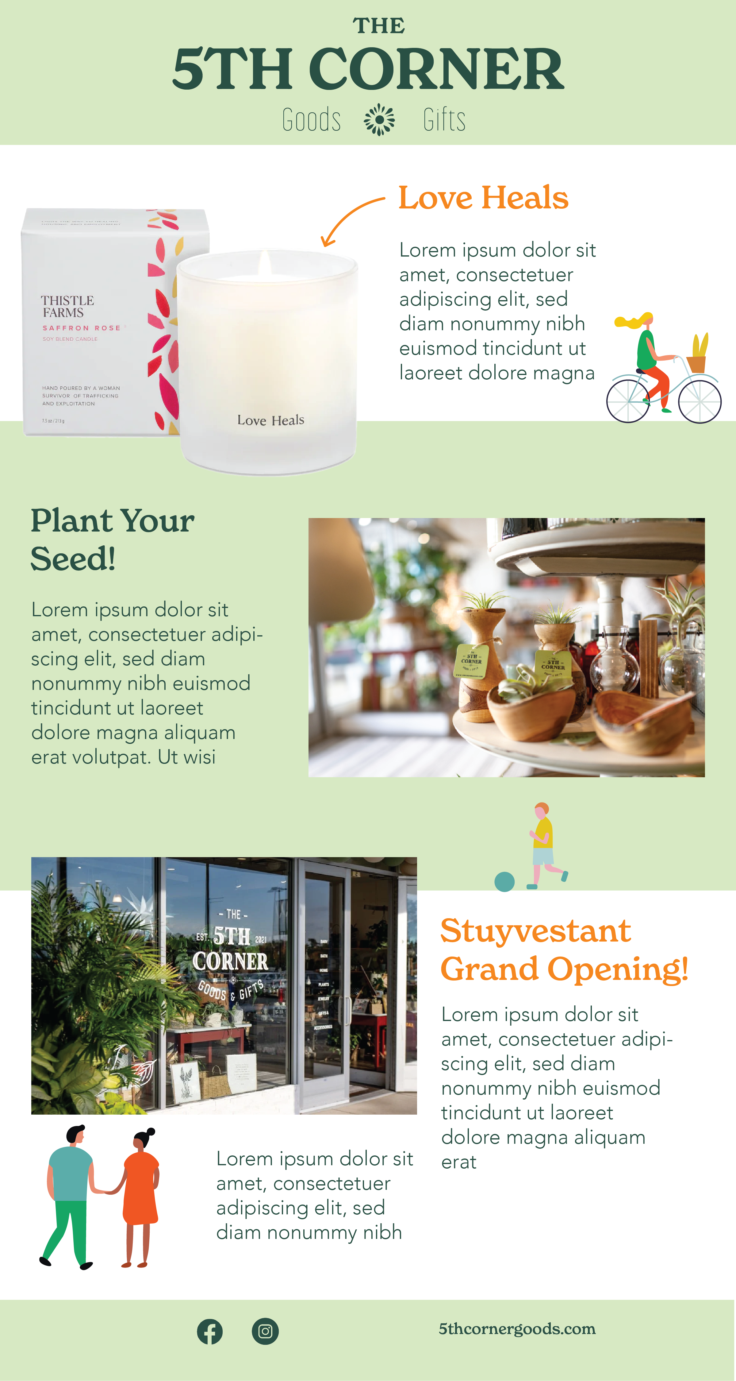
Email Blast
Here is an email blast example. It features:
Weekly Product: I highlighted product by itself, can be seasonal or not.
Weekly Sale or Promotion: "Plant your seed" implys the implementation of a plant-based sale, as the store has often
Local News: Featuring a little blurb about the store itself, whether different events they will be attending, store new, such as a new opening of a second store, or so on
Overall, I am very happy with how this turned out, I can pleased with the design and overall layout. I do want to continue to expand, adding different sections or making it longer, because information can vary from week to week for the store.