
Usability Testing: Where Clean Design Meets Cognitive Load
From Research to Real Users
After weeks of research and analysis on the Clinique website, usability testing became the moment of truth. Up until this point, much of my critique had been analytical. It’s one thing to critique hierarchy and navigation as a designer, it’s another to watch real users attempt to complete tasks in real time. And usability testing shifted the focus from assumption to observation.
Using the moderated testing structure outlined in Steve Krug’s Rocket Surgery Made Easy, I conducted three remote usability sessions via Zoom. Each participant completed five realistic, scenario-based tasks while thinking aloud. I followed Krug’s recommendation to remind participants that we were testing the website, not them. Which noticeably reduced nervousness and encouraged more honest commentary.
Every participant successfully completed the assigned tasks. However, success did not necessarily mean efficiency or clarity.
The Friction Was Subtle, But Consistent
The most revealing friction occurred during product comparison. When asked to compare two serums, each participant opened multiple tabs because there was no built-in comparison tool. Ingredient lists were lengthy, benefits were similar, and visual hierarchy did not emphasize meaningful differences. The word “overwhelming” surfaced repeatedly in post-task reflections.
Filtering presented a similar pattern. Although filters were available, two out of three participants initially relied on scrolling rather than narrowing options. This reinforced a principle discussed by Nielsen Norman Group in their research on e-commerce usability features that are not visually emphasized are often functionally invisible.
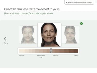
The skin diagnostic quiz (shown above), a strong brand-aligned featur, was completed successfully by all participants. However, users questioned how personalized the results truly were. Nielsen Norman Group’s research on trust and transparency in UX highlights how credibility cues significantly influence purchasing confidence. While Clinique’s dermatologist-developed positioning is strong, the quiz does not fully communicate the logic behind its recommendations.
What I Learned
Visually, the website was described as clean, clinical, and professional. Structurally, however, it created cognitive load. The friction points were not technical errors; they were moments where users had to work harder than expected to make decisions.
This process reinforced something critical for my redesign: aesthetic clarity does not automatically translate to behavioral clarity. Strong branding and strong usability are not synonymous. Even trusted, established brands must support decision-making with visible hierarchy, comparison tools, and reduced cognitive strain.
Usability testing forced me to step out of the designer mindset and into the observer role. Watching hesitation in real time was far more informative than any heuristic evaluation alone. And ultimately, that observational shift is what will guide the next phase of this redesign.