
Redesigning the Clinique Website: A UX Research Journey

Redesigning a website is rarely just about aesthetics. Behind every interface decision is a deeper question about how people think, search, and make decisions online. My redesign of the Clinique website focused on understanding exactly that; how real users navigate the brand’s digital storefront and where the experience could better support them.
This project explored the full website life cycle on a smaller scale, combining usability research, participatory design methods, and interface evaluation. By examining how users interact with the site, from first impressions to product discovery, the goal was to uncover friction points and design solutions that make the experience clearer, faster, and more intuitive.
Understanding the Problem
Clinique is widely recognized for its dermatologist-developed products and science-backed approach to skincare. The website reflects that credibility with a clean visual identity and polished product presentation. But while the brand’s aesthetic translates well online, usability research revealed that structure and navigation were not always aligned with how users naturally approach skincare decisions.
Many users arrive at the site with a clear goal—restocking a product, solving a specific skin concern, or learning about a routine. However, the site’s current navigation prioritizes product categories and promotional content. This often requires users to interpret terminology, dig through dropdown menus, or rely on the search bar to find what they need.
Over time, this kind of friction adds up. Even on visually polished websites, small navigation challenges can make a shopping experience feel slower and less intuitive.
A Research-Driven Approach
Rather than redesigning based on assumptions, the project relied on multiple usability research methods to understand how users actually interact with the site.
User interviews and surveys helped uncover motivations, frustrations, and common browsing behaviors. Personas were then developed to represent key user groups: from loyal customers who want to repurchase quickly to younger users researching skincare routines. These personas grounded design decisions in real needs rather than abstract demographics.
More structured research followed. Card sorting studies revealed how users naturally group skincare products, while diary studies provided insight into how people research and purchase products over time. A heuristic evaluation based on established usability principles examined how the site performs against known interaction standards.
Together, these methods created a layered understanding of the experience, from user expectations to structural usability issues.
What the Research Revealed
Across nearly every research method, the same themes appeared. Users often struggled to browse the site efficiently through navigation alone. Many participants defaulted to the search function because the menu structure felt overwhelming or unclear.
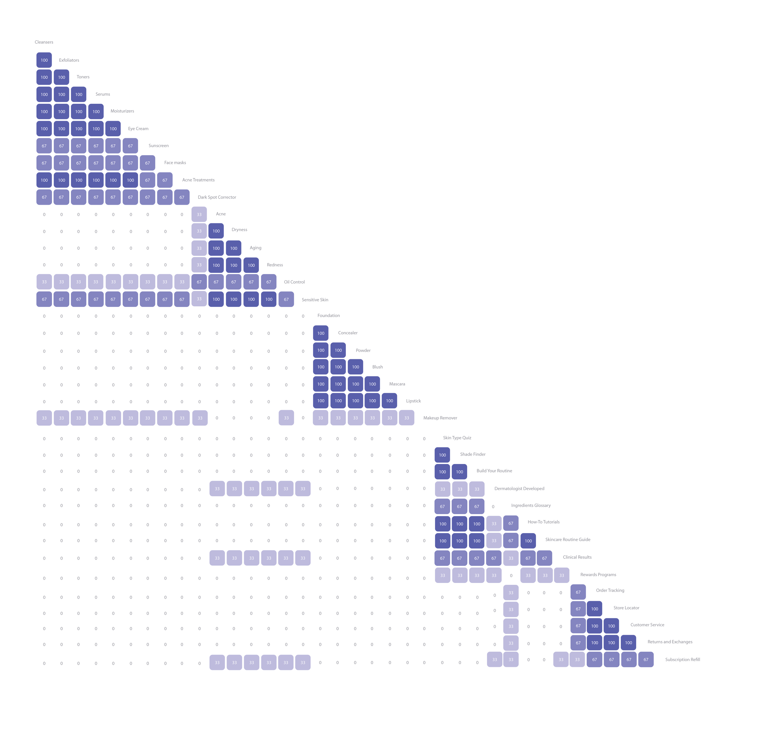
Clinique Card Sorting Matrix Results
The open card sorting study revealed another important insight: people tend to think about skincare in terms of problems and solutions, not product types. Instead of starting with categories like “serums” or “cleansers,” users naturally grouped products by concerns such as acne, dryness, or sensitivity.
This disconnect between the site’s organization and users’ mental models created friction during browsing. Users also reported feeling overwhelmed by large mega-menus and dense product grids, where many options appeared at once without clear hierarchy.
Promotional content on the homepage introduced another challenge. While marketing campaigns are important for brand visibility, stacked banners and rotating hero images sometimes distracted from decision-making tools that could help users choose products more confidently.
In short, the site worked visually, but structurally, it required users to do more cognitive work than necessary.
Designing Clearer Pathways
The redesign focused on aligning the site’s structure with the way users actually think about skincare.
One of the biggest changes involved navigation. Rather than relying solely on product categories, the proposed structure integrates entry points based on skin concerns. This approach allows users to start with a problem, such as dryness or sensitivity, and then explore relevant products and routines.
Simplifying terminology was another priority. Card sorting results showed that users consistently prefer straightforward, conversational labels. Replacing brand-driven language with clearer terms helps reduce interpretation time and makes browsing feel more intuitive.
The redesign also addresses visual hierarchy. Reducing the density of product grids, increasing whitespace, and creating clearer content groupings improves scannability and lowers cognitive load.
Finally, the site introduces stronger decision-support features, such as improved filtering and product comparison tools. These changes help users evaluate options more easily and feel more confident before purchasing.
Why User-Centered Design Matters
What makes usability research so valuable is that it reveals patterns that might otherwise go unnoticed. Individually, a crowded menu or unclear label may seem like a small issue. But when multiple users experience the same friction, those small problems become clear opportunities for improvement.
In the case of the Clinique website, the research showed that the brand’s visual credibility is already strong. The real opportunity lies in simplifying pathways, reducing mental effort, and guiding users toward the products that best meet their needs.
When navigation reflects how people naturally think. And when interfaces support decision-making rather than interrupt it, the result is a smoother experience for users and stronger engagement for the brand.