
You Have Five Seconds: What First Impressions Reveal About Your Design
Five seconds doesn’t sound like much. But online, it’s often all you get.
The Five Second Test is a UX method built around a simple idea: show someone a design for just five seconds, remove it, and ask what they remember. What stood out? What was the site about? What could they do there? The answers reveal whether your message is clear, or whether your design is quietly asking users to work too hard.
Why First Impressions Matter
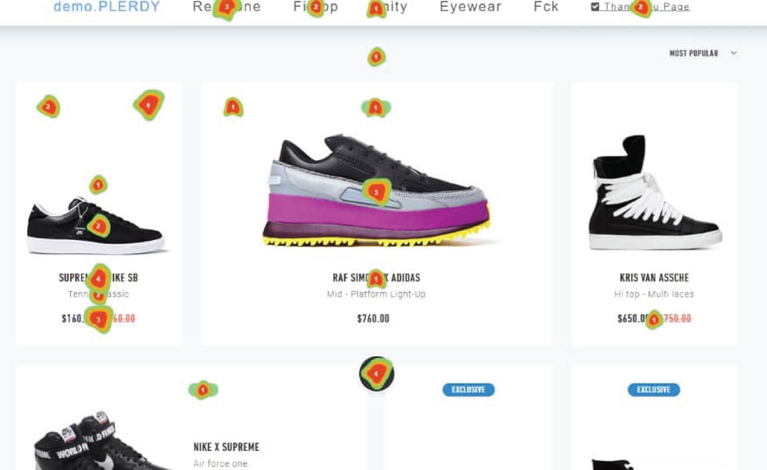
Heatmap Mouse Click Tracking - Andrew Chornyy
Mouse move tracking heatmap is a specialized tool that records user interactions with pages. This software collects mouse clicks and moves them to display them on maps updated in real-time. Such a visual representation is very convenient for evaluating the activity without diving into statistical analysis quickly.
This method is grounded in research on snap judgments. A well-known study by Gitte Lindgaard found that users form aesthetic impressions of websites in as little as 50 milliseconds. That reaction happens before users read paragraphs of copy or explore navigation menus. Those early impressions shape trust, perceived usability, and whether someone chooses to stay or leave.
Further research by Tractinsky, Katz, and Ikar found a strong relationship between perceived aesthetics and perceived usability. When something looks clear and visually balanced, people are more likely to assume it works well. In other words, design clarity isn’t just about beauty, it’s about credibility.
How to Run a Five Second Test
One of the strengths of this method is how accessible it is. You don’t need a complex lab setup or advanced analytics. A typical session looks like this:
Choose the screen you want to test: This is often a homepage, landing page, or hero section where first impressions matter most.
Show the design for five seconds: No scrolling, no clicking, just a quick, focused view.
Remove the screen and ask open-ended questions: What do you think this company does? What stood out to you? What would you click first?
Look for patterns in the responses: Are people describing your intended message, or are they confused? Do they notice the primary call to action?
Refine and retest: Adjust hierarchy, messaging, or visual emphasis, then repeat the process.
Tools like Lyssna (formerly UsabilityHub), Maze, or even a timed Zoom screen share make it easy to run these tests remotely.
How to Analyze Results
Five Second Test: Definition, Benefits and How to do it - Sanjida Satter
A step-by-step guide to ensure that your designs communicate effectively and engage your target audience from the very first glance.
Once the responses start coming in, the real insight begins. Analyzing Five Second Test results isn’t about counting every individual answer; it’s about spotting patterns and trends that tell a story about clarity and communication. UX guides suggest these strategies:
Group similar responses: Do most participants mention the headline but miss the call-to-action? That’s a sign your visual hierarchy needs refinement.
Measure comprehension: If users can explain what the page is about with the language you intended, your core messaging is landing. If not, you’ve found a messaging gap.
Evaluate emotional perception: Sometimes participants recall the feel of a design: friendly, professional, or confusing, which indicates whether tone and branding are aligned with expectations.
Look at missed elements: If key elements like buttons or values aren’t remembered, they may need stronger visual emphasis.
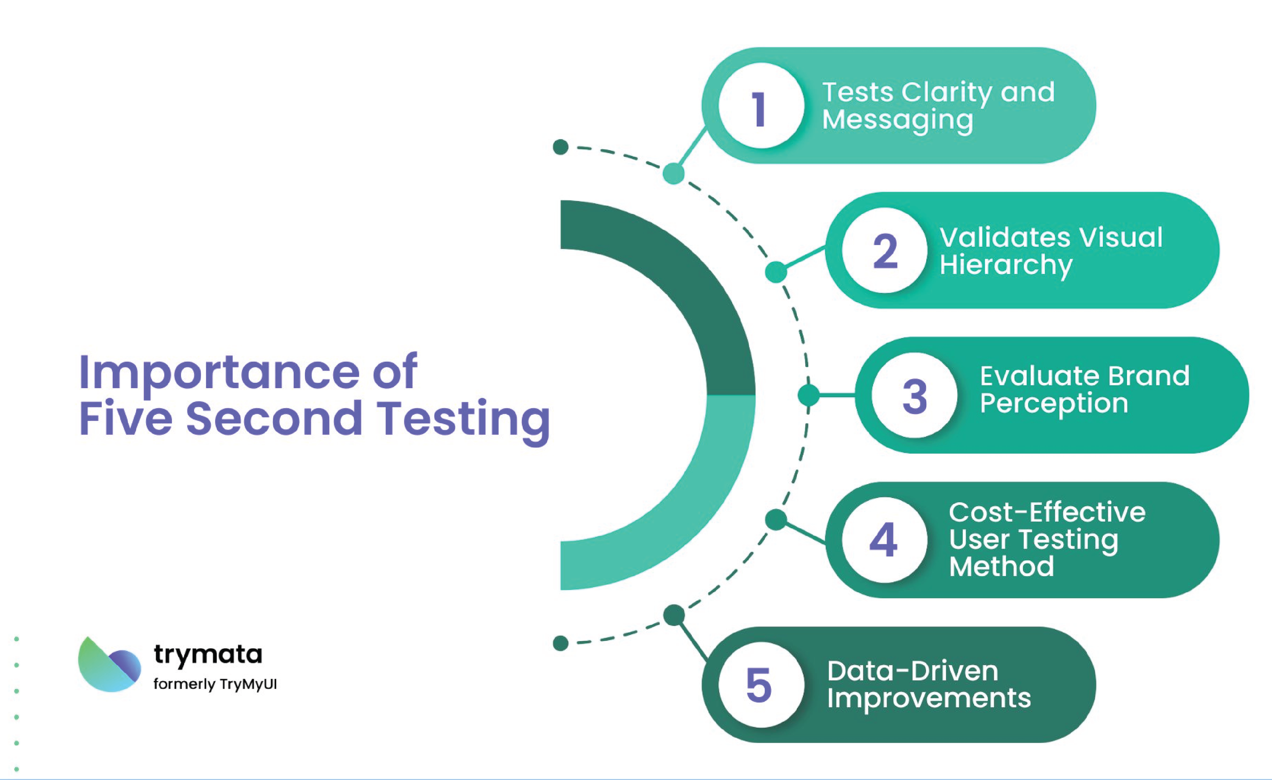
Why It Matters
Nielsen Norman Group emphasizes that a clear value proposition and strong visual hierarchy are essential to reducing confusion and bounce rates. The Five Second Test puts those elements under pressure. If users can’t articulate what your site offers after a brief glance, that’s valuable feedback, not failure.
What I appreciate most about this method is its simplicity. It removes explanations, animations, and extra context. It asks a straightforward question: Is your message clear at a glance?
Five seconds may feel short, but in digital spaces, it’s often the difference between curiosity and exit.