
Redesigning My Own Brand
Designing for yourself is one of the hardest things you can do as a designer.
There's no brief, no client to push back on, and no external deadline forcing a decision. It's just you, your taste, and a blank canvas that somehow has to represent everything you are and want to be professionally. I've been through this process twice now, and the second time looked nothing like the first.
Where It Started: The Purple Era
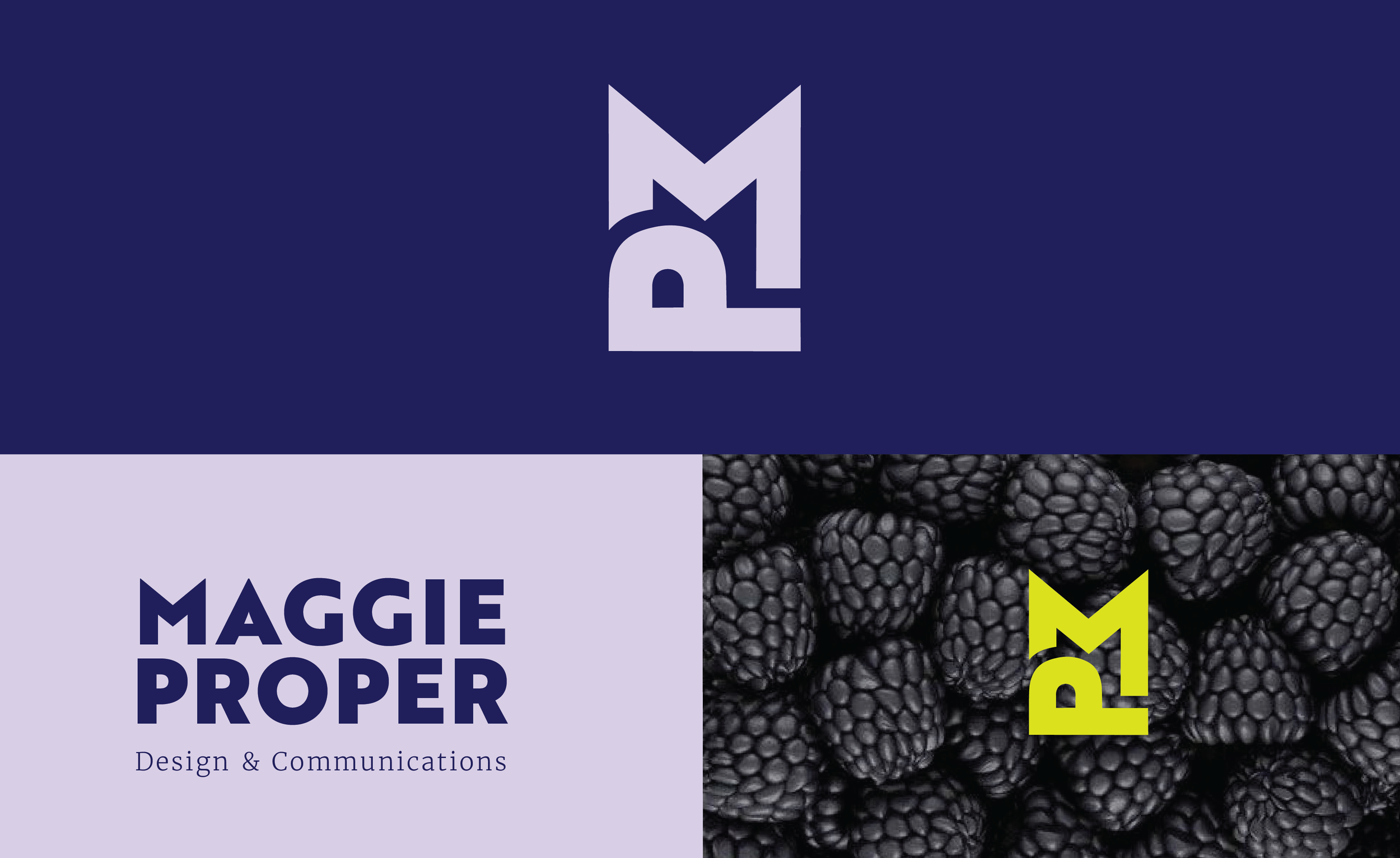
My original brand was built around a deep purple and lavender palette, a geometric PM monogram, and a pairing of Brother 1816 Black with Merriweather Light. It was clean, professional, and honestly, pretty safe. It looked like what I thought a designer's brand was supposed to look like. Bold enough to feel intentional, neutral enough to appeal to anyone. Looking back, that was exactly the problem. A personal brand isn't really about how you share what you do, fundamentally, it's about what you do, period. Mine was communicating competence. It wasn't communicating me.
What Made Me Want to Change It
It wasn't one moment. It was more of a slow realization, the kind that creeps up on you while you're deep in other work. I kept gravitating toward warmer palettes, more organic forms, and references that felt alive and textured. My mood boards were full of reds and corals and deep burgundy, and my actual portfolio sat behind a brand that felt like it belonged to a different designer. Your personal brand is a living thing, and it should evolve as your graphic design career develops. I'd grown. The brand hadn't.
The Sketching Phase
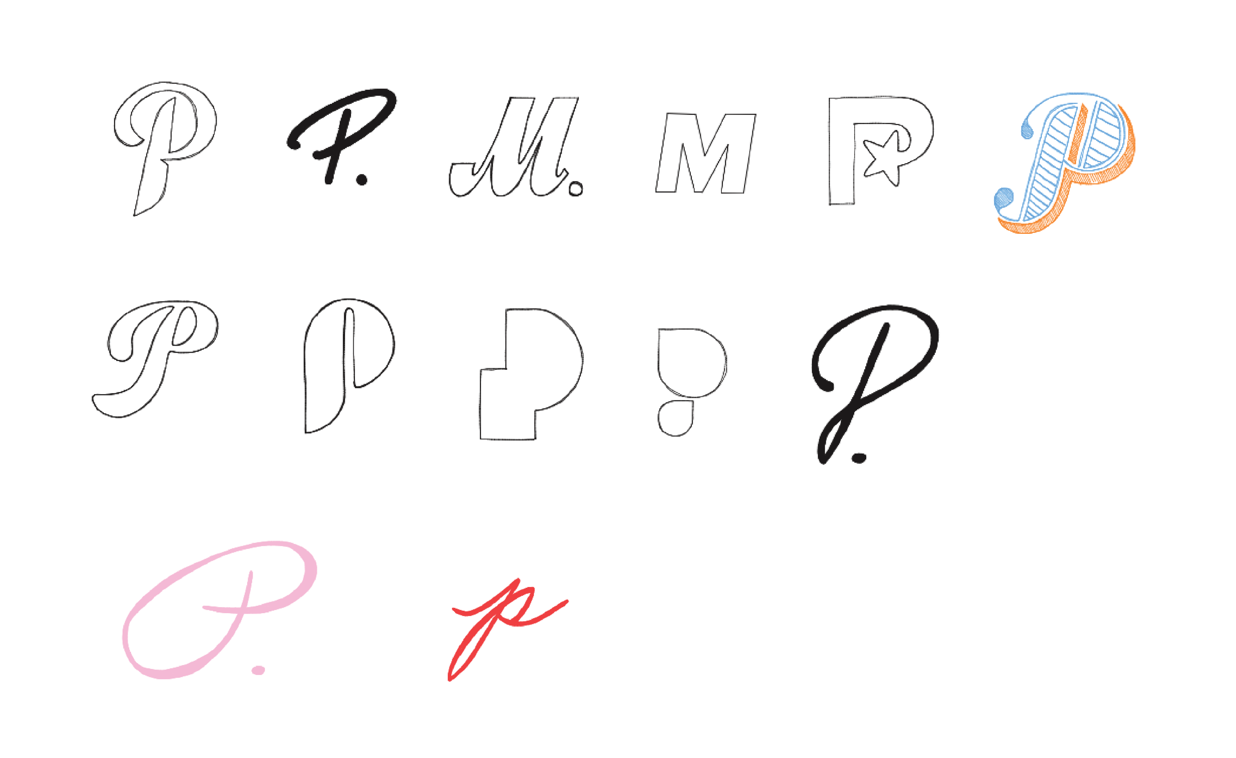
I went back to paper first, which is always where my best thinking happens. I knew I wanted to keep the monogram direction, there's something about a lettermark that feels both personal and professional, but I wanted the P to carry more personality and highlight my last name. I explored script versions, stripped-back geometric cuts, and everything in between. Then my mom wrote out the letter P in her handwriting, just to see what it looked like. And that was it.
There's something design theory can't fully account for: the emotional weight of a mark. In personal branding, storytelling involves sharing personal experiences, challenges, and lessons learned to humanize the brand and make it more relatable and authentic. My mom's handwriting became the foundation of the new script P that anchors my logo, a detail most people will never know about, but one that makes the whole thing feel grounded in something real. That kind of hidden meaning is what separates a logo from a brand.
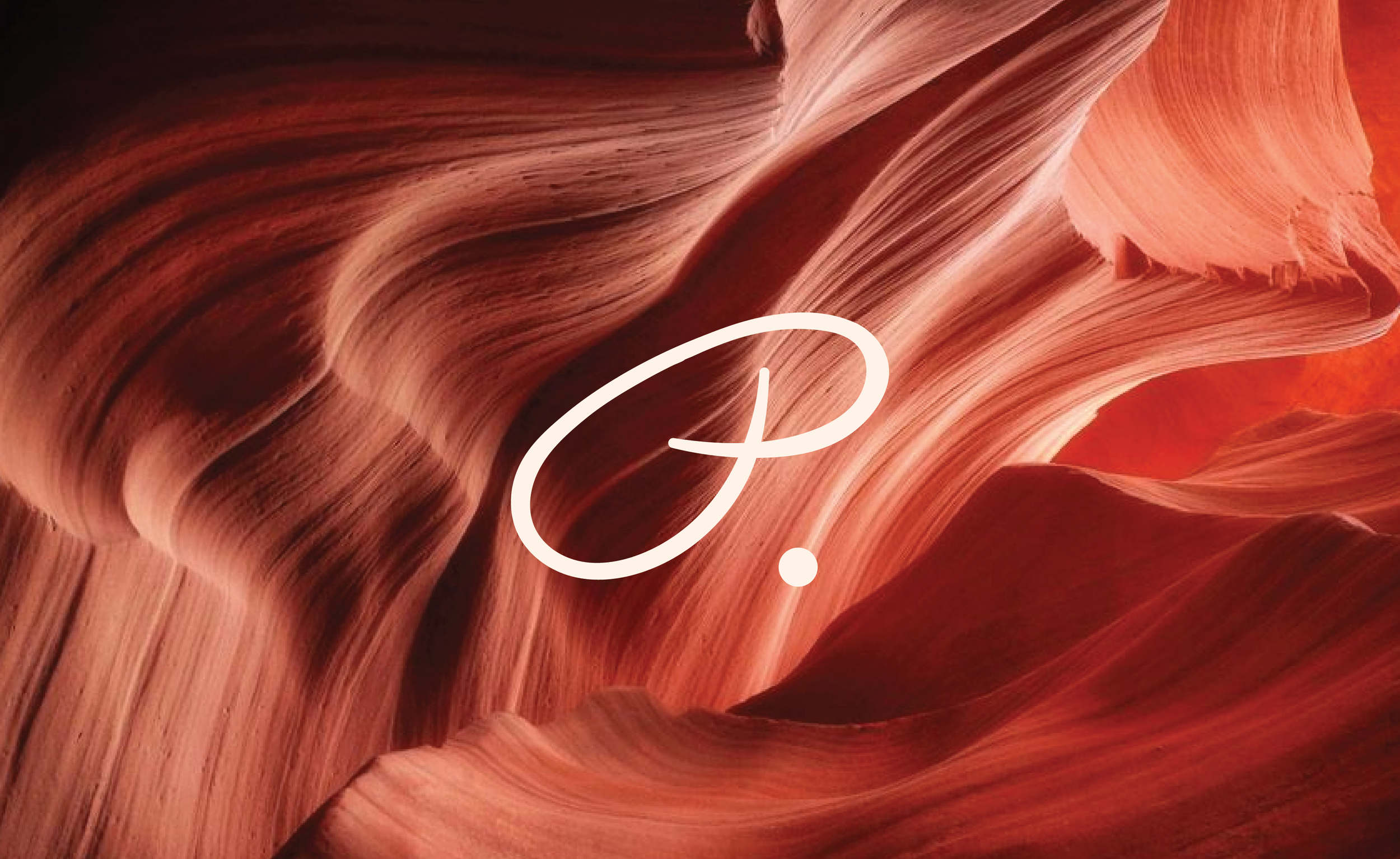
The New Direction
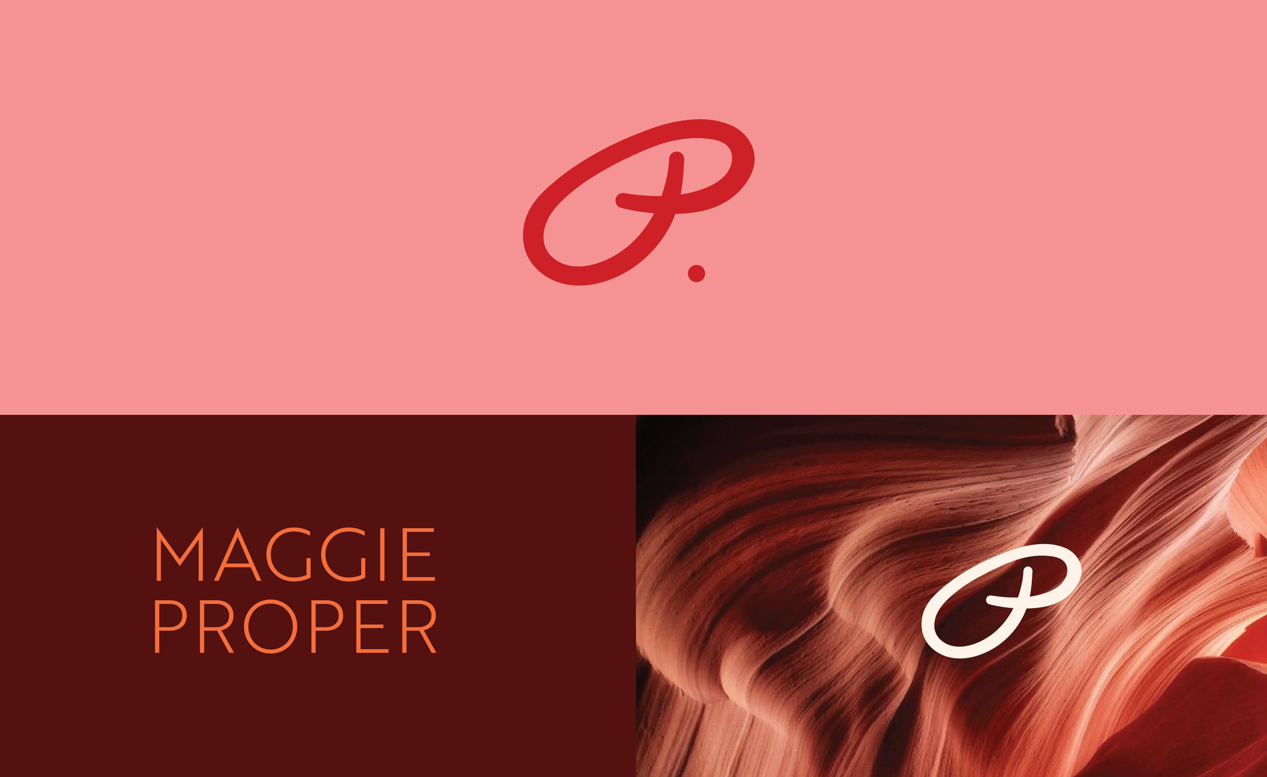
The refreshed palette: a warm salmon pink, burnt orange, deep crimson, and a red that almost vibrates. The opposite of what I had before. It's confident without being loud, warm without being soft. Paired with Merriweather Ultra Bold and Brother 1816 Light, the system has tension in the right places: something heavy anchoring something airy. The texture references, the layered canyon rock, brought in an organic quality that the geometric version never had.
When your brand reflects who you truly are, it's more than a professional asset. It's a powerful tool for connection, trust, and lasting influence. I don't think I fully understood that when I built the first one. I do now.
What I'd Tell Anyone Doing This
Don't rush it, and don't start with the logo. Start with what you're drawn to and ask yourself why. The visual answers will follow. Stick to what you love, you might just build your whole brand around it.