

Typography
The Project
Role: Designer
Project Type: Type Design
Tools: Indesign & Illustrator
Year: 2025
This many projects allowed me to explore type as both form and function. I produced a range of deliverables—including an event poster, a typeface specimen booklet, and a designer research zine—each showcasing a different facet of typographic expression. These pieces were rooted in historical study, visual hierarchy, legibility, and design systems.
Event Poster
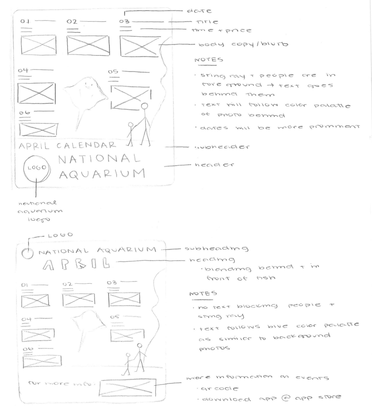
Sketches
I experimented with alignment, typographic scale, spacing, and weight to create a system that balances structure and excitement. I used centered and flush-left alignments to contrast structured data (event times and prices) with flowing, narrative text.
Use only typography to communicate a multi-event schedule for the National Aquarium.
Build a clear visual hierarchy that separates key event information, dates, and pricing.
Work with constraints—no imagery or color—focusing purely on form, space, and flow.
Final Design
I experimented with alignment, typographic scale, spacing, and weight to create a system that balances structure and excitement. I used centered and flush-left alignments to contrast structured data (event times and prices) with flowing, narrative text.
The final piece establishes a strong typographic rhythm, with clearly defined entry points (event titles) and supporting information. The refined use of whitespace and consistent type style creates a dynamic yet organized layout.

Type Booklet
Logo Sketches
Present the typeface through expressive yet educational layouts.
Highlight character anatomy, stroke contrast, alignment, and spacing.
Showcase digital typesetting for headlines, body copy, and decorative use.
Features
Full font family overview: Regular, Italic, Bold, Bold Italic.
Character spotlight: “e,” “g,” and “t” analyzed in detail.
Thematic design keywords: “Balanced,” “Modern,” “Geometric,” “Friendly.”
Emphasis on display and interface versatility through mock layouts.

Final Design
I experimented with alignment, typographic scale, spacing, and weight to create a system that balances structure and excitement. I used centered and flush-left alignments to contrast structured data (event times and prices) with flowing, narrative text.
The final piece establishes a strong typographic rhythm, with clearly defined entry points (event titles) and supporting information. The refined use of whitespace and consistent type style creates a dynamic yet organized layout.