
RAFIKI
Role: Web Designer
Project Type: Website Design
Tools: Adobe Suite, Figma
Timeline: January to June 2025

Overview
Rafiki, Swahili for “friend”, is a mobile-first web prototype designed to support African animal conservation through education, awareness, and community action. Developed during a Web Design course, this cross platform project prioritized responsive UX UI design, accessibility, and digital storytelling. Using Adobe Dreamweaver and Figma, I built interfaces for mobile, tablet, and desktop experiences to ensure broad accessibility and usability across devices.
Design Approach
Initial Attempt
My initial attempt features:
Hamburger Menu: aligned to the right, I thought replicating the navigation closest to the mobile layout would work, but as you can see in the new version I opted to take it out
Large Graphic: taking up a majority of the screen, the graphic almost bombards the viewer initially
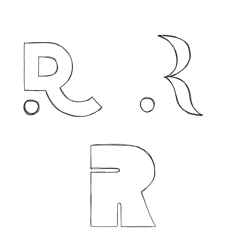
Wordmark Logo: the original logo features the entire title with little kerning, making the letters almost merge together
Large Heading: narrowing down towards the bottom of the screen, it may take a second to find. This is another thing I made sure to change moving forward
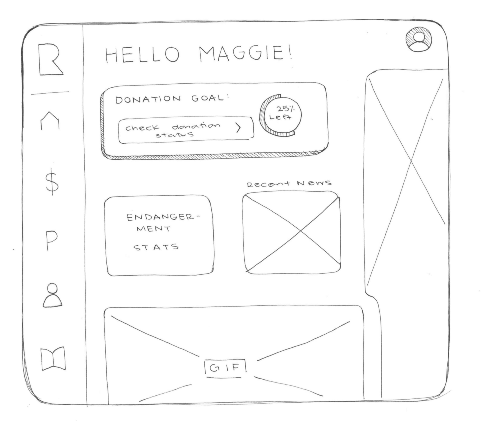
Final Attempt
My second attempt features:
Menu Bar: aligned to the left this time, each page is vertically made. As shown within the prototype, there are transitions between page to page that help the viewer transition in the easiest way possible
Smaller Graphic: the fun animal graphics still remain, just don't take up a majority of the screen. This way more features of the website can be better seen initially.
Symbolic Logo: I opted for just an "R" that flows more with this new layout and design. Viewers can see the clear intention of the logo, as compared to the workmark prior.
Smaller Heading: the heading is featured at the top of each page, clearly defined. This offers a more inviting and personalized approach for the viewer