
Thrift Shops Gone Digital

When you think about thrifting, you might picture sifting through racks of clothing, discovering hidden gems, or chatting with a friend while trying on something unexpected. That same experience has shifted online, and two of the biggest players, Depop and Poshmark, offer completely different vibes for secondhand shopping. In my analysis, I looked specifically at the UX (user experience) and UI (user interface) of both sites, and it’s clear how much design decisions impact the way we shop and feel online.
First Impressions Matter
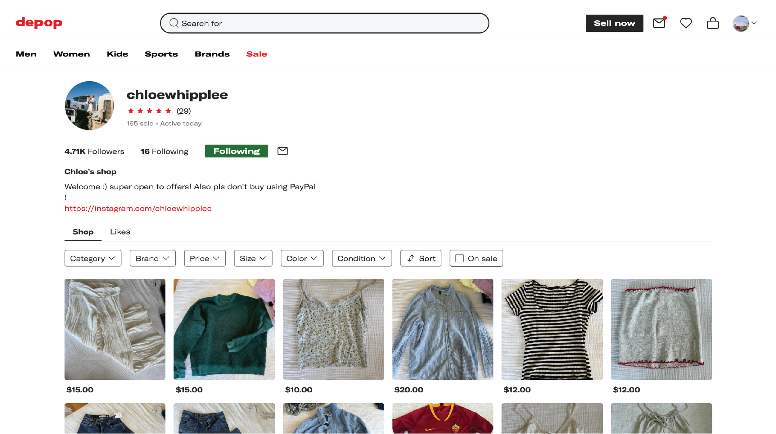
Depop makes a strong first impression on its landing page, where bold images and colorful visuals immediately set a playful tone. The interface feels alive with energy, almost like walking into a trendy thrift store bursting with personality. This creativity carries over to the seller pages, where individual storefronts resemble curated social media feeds. Browsing through them feels personal and engaging, almost like you’re being invited into someone’s closet. But with that charm comes a downside; the busy layout can feel chaotic, and the constant flow of images sometimes overwhelms the eye.

Poshmark’s landing page tells a very different story. The design is stripped back, muted, and much more structured. Instead of encouraging exploration through bold visuals, it funnels users directly into categories and filters, making it simple to get straight to the items they want. The seller pages reflect the same approach. Listings are clean, repetitive, and consistent, which supports a feeling of safety and organization. This predictability makes the shopping process smooth, but it can also feel uninspiring compared to the playful discovery offered by Depop.
Shopping as an Experience
When comparing the two, it becomes obvious that each platform prioritizes different emotional needs. Depop thrives on encouraging creativity, self-expression, and interaction, creating an atmosphere that feels vibrant and community driven. Shopping there can feel fun and inspiring, though sometimes exhausting if you’re not in the mood for constant stimulation. Poshmark takes the opposite path, offering an experience that is straightforward and reliable, giving users confidence in their purchases but leaving little room for the playfulness that makes thrifting so exciting.
What This Says About Us
These design choices highlight who each platform is built for. Depop resonates with younger users who see fashion as personal storytelling, where every listing feels unique. Poshmark speaks to shoppers who are motivated by value and reliability, where efficiency matters more than style.
Added to this, platforms like Poshmark and Depop foster a sense of community that goes beyond shopping. Glamour’s reporting on these resale apps sheds light on how social interactions like emoji-filled conversations, “love notes,” and personalized packaging, create an emotionally supportive environment that users find meaningful. This emotional layer isn’t incidental, it’s baked into how these platforms communicate, how their pages are structured, and how they engage users.
So when you land on Depop and feel like you're wandering through a lively boutique, or step into Poshmark and feel like you're navigating a dependable closet, those aren’t just stylistic choices. They’re design decisions validated by how users think, feel, and shop.
Why It Matters
By studying UX and UI, we see how colors, layouts, and tone go beyond aesthetics; they shape behavior and emotion. Depop excites and inspires, while Poshmark reassures and organizes. Neither is “better”; they simply reflect different audience needs.
For designers, it’s a reminder of how powerful design decisions can be in shaping digital interactions. For everyday shoppers, it’s worth noticing how a website’s design influences not just what we buy, but how we feel while browsing. Whether you’re in the mood for playful discovery or structured efficiency, these two platforms show just how much design matters in our digital thrift shop experience.
See more of my Website Analysis.