
Type is Never Just Type
I can't walk into a coffee shop or scroll past an ad without clocking the type first. Before the color palette, before the copy, I've already formed an impression. It's become a reflex, and once you develop it, you can't turn it off.
But this isn't just a designer quirk. Muhammad Fiaz explains that people form judgments about a brand within milliseconds of seeing text, before the conscious mind has even caught up. Typography is doing heavy emotional lifting that most people don't realize is happening. And as designers, that's exactly the kind of invisible power we should be paying attention to.
What Type Is Actually Saying
A typeface isn't just a vehicle for words, it's a personality. It carries attitude and association that the reader feels before they process what's actually being said.
A condensed, high-contrast serif whispers editorial, considered, fashion-forward. A rounded sans-serif says friendly, approachable, maybe a little playful. None of that is accidental. According to CCC Creative, a brand's core values can be communicated through typeface alone, shaping both explicit and implicit impressions. Typography does that quietly, constantly, and whether the designer intended it or not.
Passive type choices are still choices. Defaulting to a system font or grabbing the first clean option on Google Fonts communicates something too, usually that typography wasn't a priority. People pick up on it, even if they can't say why.
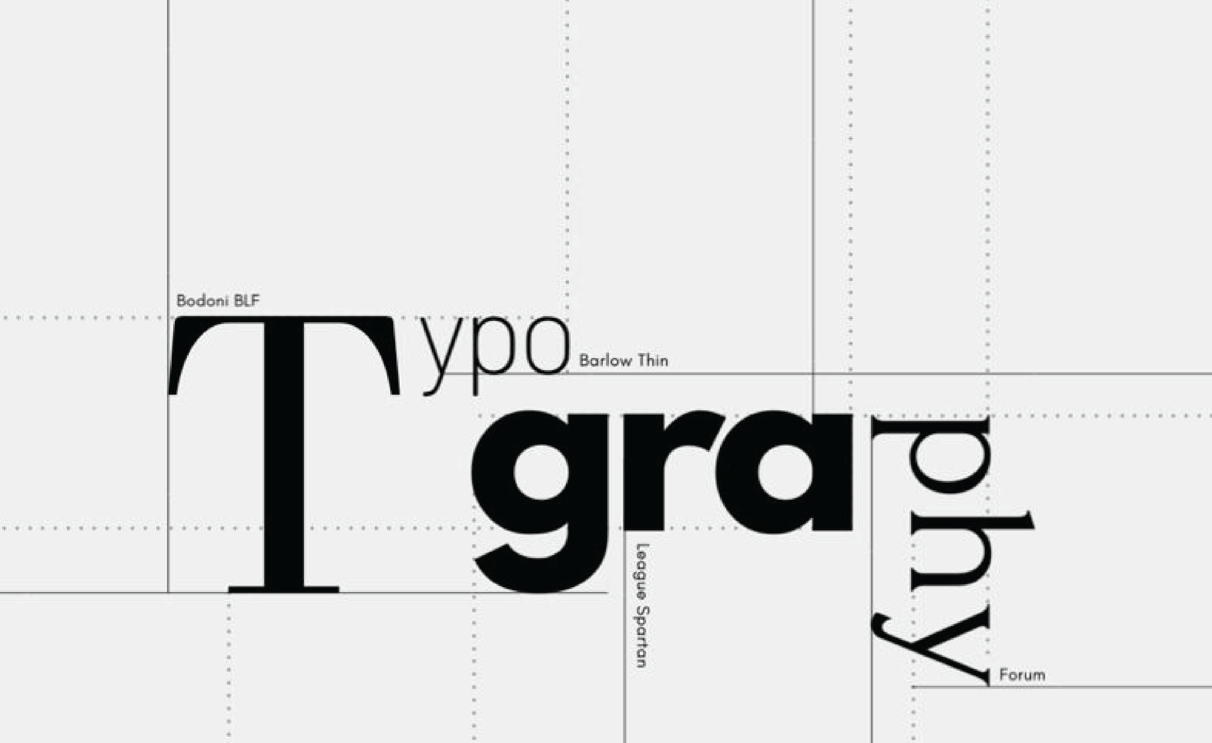
Serif vs. Sans Isn't the Whole Conversation
Designers love to debate serif versus sans-serif, but I think it's one of the more reductive ways to talk about type. Yes, serifs carry tradition and authority, think New York Times or Garamond on a luxury package. Sans-serifs read as cleaner and more modern; your Apples, your Googles. Research from Wichita State Universitybacks this up. But reducing typeface selection to that binary misses most of what makes typography interesting.
What I'm actually thinking about: weight, contrast, x-height, how letterforms behave at small sizes, what happens to a paragraph when the leading opens up. The brands that get type right aren't just picking a category, they're thinking about how every variable works together. Netflix Sans is a good example, built specifically to feel modern and innovative while functioning seamlessly across every screen size they operate in. That's not a serif-versus-sans decision. That's a typographic strategy.
The Typefaces I Keep Coming Back To
I'm drawn to type that has conviction, something that knows what it is. Lately that's been Canela for the way it blends editorial warmth with something still readable and grounded. Söhne has been in constant rotation too; clean grotesque functionality but with enough texture that it doesn't feel sterile. For display work, I'm pulled toward type with some visual tension, proportions that are slightly unexpected, weight distribution doing something interesting.
What they all have in common is intentionality. You can tell considered decisions were made at every curve and counter. That's what I'm looking for, type that has a point of view.
Why It Matters More Than People Think
I've had conversations with clients where type gets treated as the last thing, something you figure out after the "real" design decisions. That framing frustrates me, because by the time you get to type, you've already decided what the thing should feel like. If they're not in agreement, the whole system works against itself.
Monotype research found that intentional typeface choices can increase positive consumer responses by up to 13%. And an MIT psychologist found that people reading a poorly typeset page were measurably more likely to report negative emotional states, the muscles associated with frowning are linked directly to the brain's emotional center. Typography is getting into people's heads whether we acknowledge it or not.
That's what keeps me obsessed with it. It's one of the few design elements operating on the conscious and subconscious at the same time. Getting both working together in service of the same idea, that's one of the most satisfying problems in design.