
Brands that are Getting it Right

I spend a lot of time paying attention to brands, not just as a consumer, but as a designer trying to understand what's working and why. Some brands do safe, competent work. A few do something that actually makes you stop and look twice. This is about the latter.
These are three brands I keep coming back to right now, and what I think student designers can actually learn from them.
Vacation: Committing to the Bit
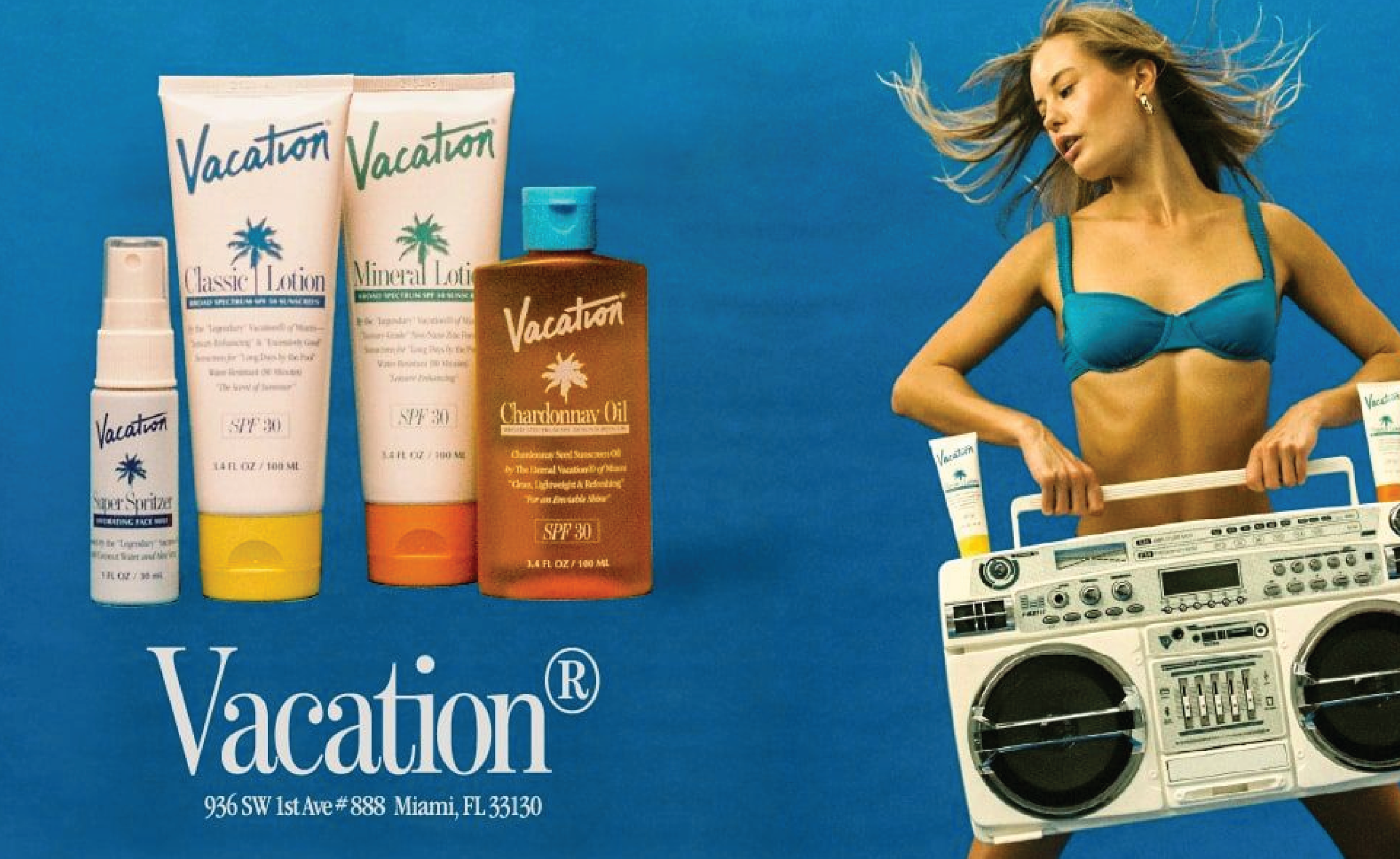
Vacation is a sunscreen brand, but describing it that way almost misses the point. The brand was built around a fully realized 1980s resort world; washed-out photography, condensed serifs, the kind of typography that looks like it came off a real Club Med brochure, not a mood board of one. Everything from the product names to the Instagram captions exists inside that world. One post introduces a fictional "Lead Scent Facilitator." Another advertises a hovercraft that doesn't exist.
What makes this work isn't the nostalgia itself. Plenty of brands reach for retro and come out looking like a Halloween costume. It's the level of commitment. According to PRINT Magazine, every touchpoint was designed to spark joy regardless of how someone first encounters the brand. The typography is considered, the photography is consistent, the copy and the visuals are pulling in exactly the same direction. That kind of coherence doesn't happen by accident.
The takeaway for designers: a strong concept only works if every single execution decision supports it. One lazy touchpoint and the whole world falls apart.
Graza: Design as an Argument
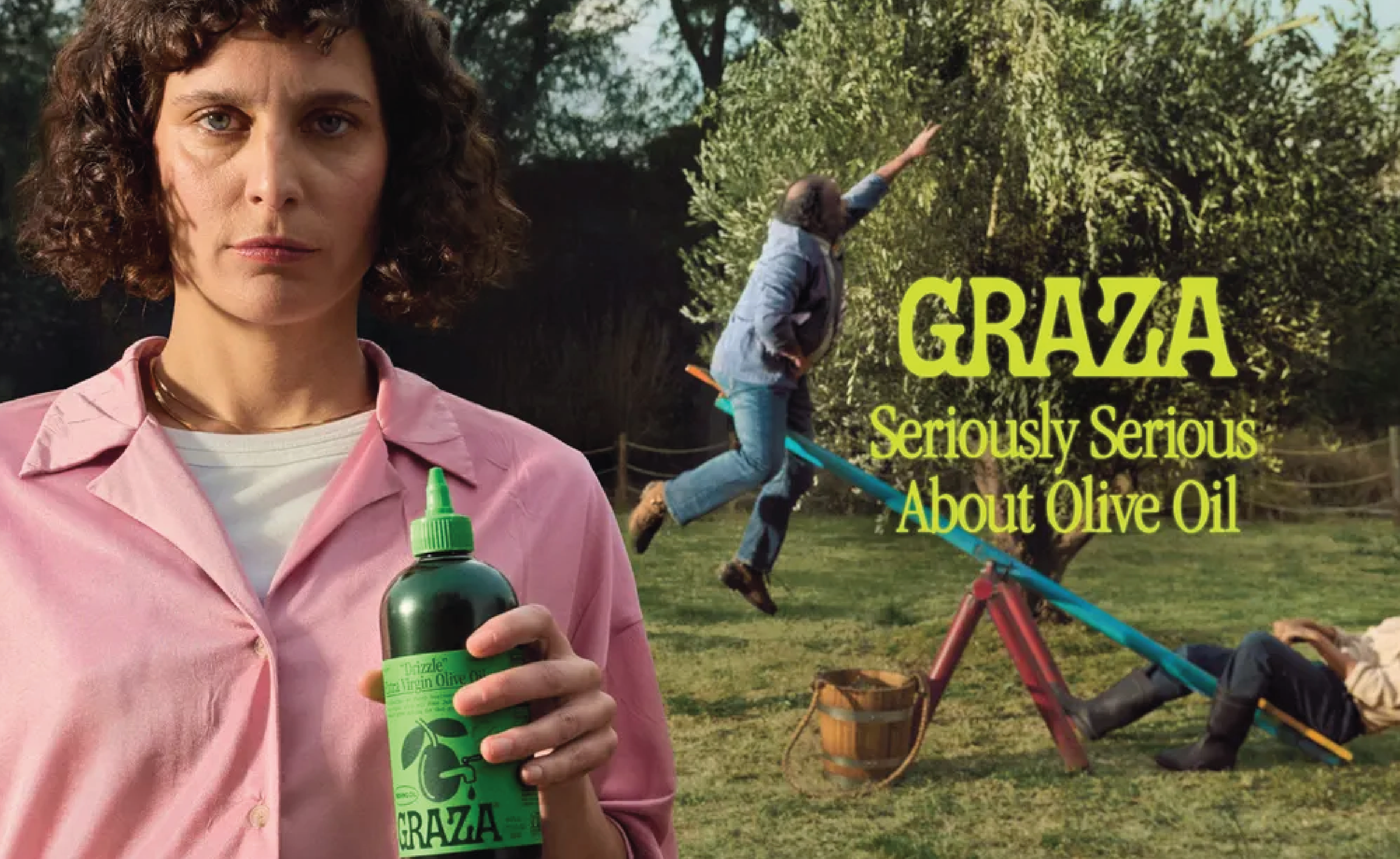
Graza is olive oil in a squeeze bottle. That sounds simple, but the design is making a real argument: premium olive oil shouldn't live on a shelf and be used sparingly, it should be in your hand, getting squeezed over everything. The brand identity, developed by Brooklyn studio Gander, reflects that directly. Bright color, playful illustration, bold typography that feels approachable rather than precious.
In a category full of dark glass bottles and hushed, reverent branding, Graza is conspicuously fun. And it works because the design isn't just decorative, it's reinforcing the brand's entire argument about how olive oil should be used. The bottle itself is the brand. Someone even got a tattoo of the Sizzle illustration.
The takeaway: good design doesn't just describe a product, it embodies the product's reason for existing. When the form and the message are the same thing, you know it's working.
Dark Arts Coffee: Personality Over Safety
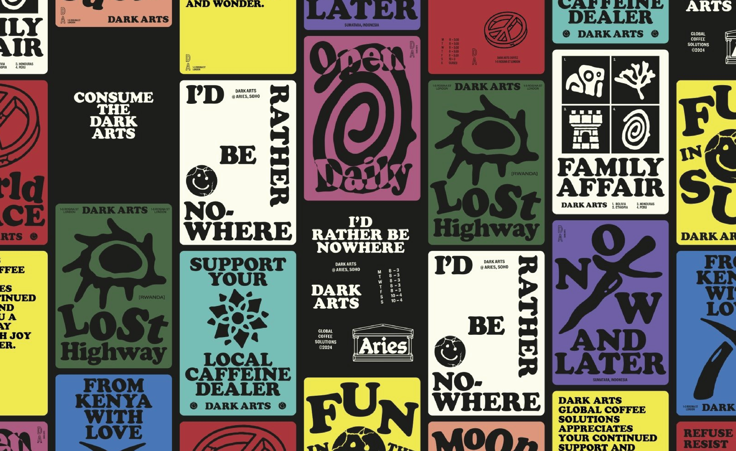
Dark Arts Coffee out of London has always had an edge, but their recent rebrand is worth paying attention to. Per Creative Pool's 2025 brand identity roundup, the new identity moved away from heavy-handed imagery toward something weirder and more layered; tarot-like linocut illustrations, surreal photo collages, naive doodles, all held together by bold black packaging and a dry wit that keeps the whole thing from taking itself too seriously. They also introduced collectible art cards with each roast, over 50 unique designs that give the brand something to keep building.
What I love about this is that they found a way to evolve without softening. The new identity is more sophisticated than the old one, but it's no less strange. That balance is having a strong personality and being willing to refine it without losing it. Its harder than it looks.
The takeaway: visual consistency doesn't mean visual sameness. A brand can grow and get sharper while staying completely itself.
What These Have in Common
None of these brands are doing work that's safe. All three took a genuine point of view, built a visual system around it, and executed it without hedging. That's what separates the brands worth studying from the ones that just look fine.
As someone still building my own visual sensibility, I find that more useful than any trend report looking at brands that made a real decision and following the logic of how they got there.